Finding Comfort in Colour
Your home should be your sanctuary—a place where you feel comfortable, relaxed, and entirely yourself. But creating that environment often starts with a key question: what colours make you feel at home?
For some of us, this might be an easy answer, but for others, it can be a harder task which is where a colour consultant can be helpful. We always recommend choosing your colours before you hire your decorators, so if 2025 is your year for redecoration then read on.
From selecting the perfect palette to experimenting with textures and finishes, Charlotte Cropper (former International Colour Consultant at Lick, and Bauwerk Colour in -house consultant), offers valuable insights to help guide you through.
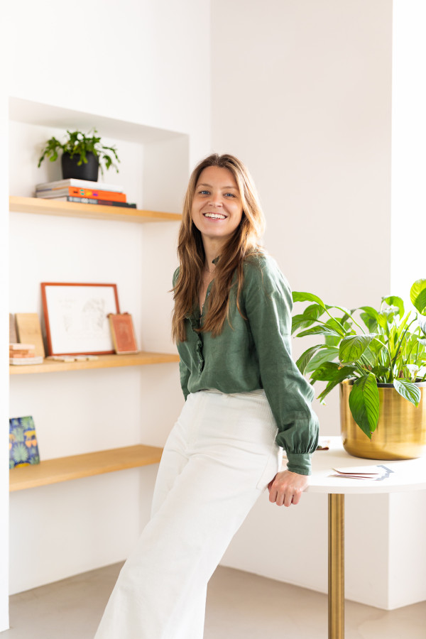
PTTG - How would you recommend homeowners begin the process of selecting colours, textures, or finishes?
Charlotte - When it comes to choosing paint colours for your home, my best advice is to actually not start with colour. Instead we need to dig deeper into how we use our homes and what we require from them to live well. Start by considering the function of your room and the mood you’d like to create to support its purpose. Perhaps you’re decorating your living room - you might use this room all day everyday, or perhaps it’s only used in the evenings to watch TV after long days at work. Based on how you use this space, how do you want to feel in this room? What mood do you want to create? Perhaps it’s cosy and warm, or light, bright and energising.
Once you have these key ideas, the next step is to consider the natural lighting in your space, is it cool and dark or filled with south-facing sunshine? This will then help inform the tone of the colours and materials you choose. Yellow, red and brown based colours will inject warmth into cold spaces, while cool blue, grey and green based colours will balance any direct sunlight. It’s also important to consider your surroundings, are you working with existing finishes and decor or are you starting from scratch?
My top tips:
- Consider your colours and materials holistically as an overall colour scheme. We never see colour in isolation, so it’s important to think about how your chosen colours work together and not as individual elements.
- Consider the architecture and history of your property - is there anything here that could be celebrated or inspire your colour scheme?
- It’s so easy to get caught up in picture-perfect homes on Pinterest and Instagram. There’s nothing wrong with making a Pinterest board, but try and dissect your moodboards and get into the nitty gritty of why you love particular images and interior spaces.
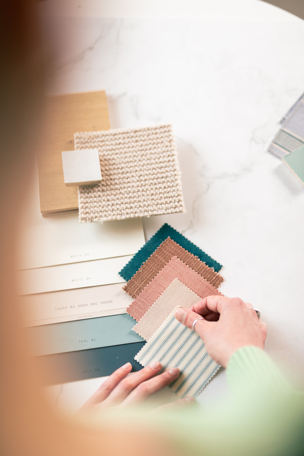
Exploring Colour Psychology
PTTG - Can you share some insights into how different colours can influence mood and create a sense of comfort in a space?
C - We generally relate to colour in three ways:
- Personal experiences—positive or negative associations we’ve developed over time.
- Cultural influences—how colours are perceived within our society.
- Colour psychology—our subconscious emotional responses to different hues.
We all naturally gravitate toward certain colours because of the positive memories tied to them. Your “personal palette” is a reflection of this, and incorporating these shades into your home can create a comforting environment.
To explore this, think about why you love certain colours. Then, experiment with lighter or darker versions of those shades to see which work best for the mood and function of your space.
Discovering Style
PTTG - For those who don’t yet have a clear sense of their interior style, what practical steps can they take to uncover what resonates with them?
C - Finding your style is a gradual process. It’s about discovering what you love—and what you don’t. Here’s how to get started:
- Take notes: Pay attention to the colours, textures, and patterns you’re drawn to in everyday life.
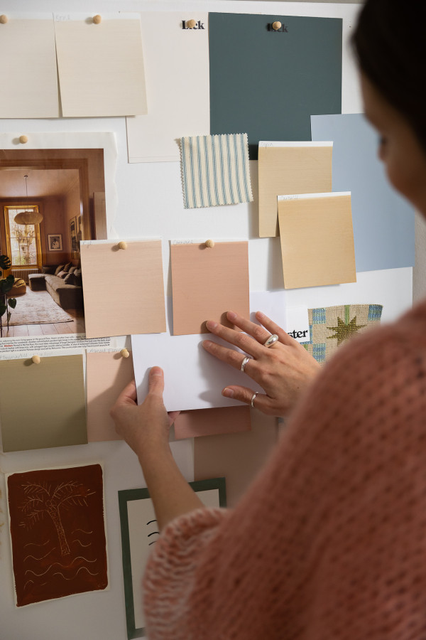
- Create a mood board: Collect images that resonate with you and analyse why you like them.
- Tell your story: Forget about trends. Instead of asking, “What’s my style?” think, “What’s my personal story?”
Your style should reflect who you are, not what’s trending. It’s okay to mix influences and evolve over time.
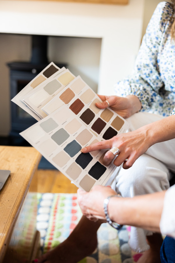
Testing Colours
PTTG - What’s your advice for testing and visualising colour options, wallcoverings, or textures before committing to a full wall or room?
C - Sampling colours and materials is really important, because the colours we see online or even in the paint store won’t necessarily look the same in our homes. If you can, paint your colours out on large sample areas, to get a good indication of the colour on a bigger surface area.
- Observe them in both natural and artificial light over several days. Paint colours will change significantly depending on the light, especially natural finishes such as limewash.
- Move your samples around the space. Place them near windows where there’s ample sunlight, at the back of the room where light is more limited, and even next to larger furniture pieces. This will help you ensure the colours and textures work harmoniously with the room’s lighting and existing elements.
PTTG - Do some colours only work in specific spaces? If you love a particular green and move house, how can you ensure it still works?
C- I believe it’s all about trying and testing. To see if your favourite green will work in your new space, try painting it onto a portable board or some lining paper. This allows you to move it around your new home and observe how it interacts with the light in different rooms. Keep in mind that changes in flooring, finishes, and surrounding materials may affect how the colour harmonises with the space. That said, it could still work beautifully! Additionally, the history and architecture of your new home might inspire new colour ideas. If the green doesn’t feel quite right, why not incorporate it as an accent through smaller decor or furniture, keeping a connection to a colour you love.
The Role of Paint Finishes and Textures
PTTG - How can people decide which paint finish—matt, eggshell, or limewash—works best for their space and lifestyle?
C - These are various factors that go into choosing the right paint finish, such as the surface types (walls, joinery etc), the room's function (is the room a low, mid or high traffic area, does it need to be moisture resistant?), lighting, desired aesthetic, and maintenance requirements.
Matt is non-reflective, hides imperfections well, and creates a smooth, velvety appearance, while eggshell is slightly reflective, generally more durable than matt, and easier to clean. Some paint brands have developed modern matt finishes that are just as durable as eggshell, making the choice a matter of aesthetic preference. Limewash on the other hand is natural, breathable, and eco-friendly, but may require reapplication in high-traffic areas.
PTTG - Does limewash work in all spaces, or can it clash with certain architectures?
C- The beauty of limewash is that it can work in any interior space, no matter the age, history or architecture of the property. It works beautifully on both interior and exterior surfaces; however, surface preparation requirements can vary depending on the material. If you’re considering limewash, I recommend consulting with a limewash expert to ensure it’s the best choice for your project.

Tips and Tricks
PTTG- How can homeowners use colour and texture to complement existing architectural features or furniture they already own?
C- Colour can enhance architectural features by making them stand out or blend harmoniously with the space. For example, painting a bold shade on decorative moulding can create a focal point, while a lighter palette ensures natural textures remain the star.
When working with furniture, take cues from standout pieces like artwork or fabric. Use these elements as inspiration for your wall colours to create a cohesive scheme.
PTTG - What advice do you have for making small or dark spaces feel cosier without becoming cramped?
C - Again this always comes back to what works for you. Often with small, dark spaces, I love encouraging clients to embrace the darkness and colour drench a space with a beautiful mid-dark tone. But this might not work for everyone. If you prefer light tones and embracing the darkness just isn’t for you, opt for neutrals or pale colours with warm undertones and layer lighting to create depth and cosiness.
Common Pitfalls to Avoid
PTTG - Are there any common mistakes people make when selecting paint colours or finishes, and how can they avoid them?
- C - Not sampling: Always test colours on a larger scale and observe them over several days.
- Playing it safe: Avoid defaulting to beige or white. Experiment with bold choices to reflect your personality.
- Ignoring the ceiling: White ceilings can often feel jarring. Instead, consider painting them a complementary shade to your walls.
PTTG - What’s a colour you’re loving right now?
C - Right now, I’m drawn to chocolate browns with burnt red undertones. They’re warm, rich, and soulful—a perfect choice for creating a cosy, grounded space.

Feeling Inspired?
If you’re ready to transform your home this year, whether that means finding your personal palette through to full home renovation then contact us today.
You can book a colour consultation with Charlotte directly through this link
Instagram - https://www.instagram.com/charlottecropperdesign
Substack - https://charlottecropperdesign.substack.com/p/my-colour-of-the-month-brown
Photography by Dario Di Maggio. Copyright reserved