How to go bold with colour

As London-based painters and decorators, we have the privilege of working with many prestigious and talented interior designers. Working for interior designers is a real treat as they explore nuanced colour palettes and decorative schemes that are inventive and individual to their creative style. The finished result is always stunning. And we love that we get to bring their designs to life with our decorating services. 

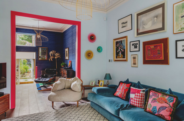
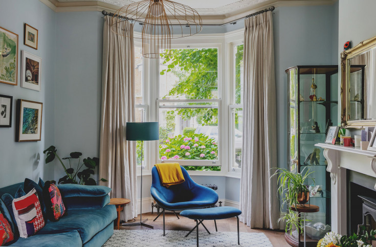
One of our most recent projects was for Manu Interiors who created an incredible scheme for a beautiful home in Tufnell Park, North London. This was a great example of our Refresh & Refine service which covers projects that involve multiple trades beyond straight forward decorating, such as carpentry, plumbing, electrics, and minor building work. We coordinate and manage all of these trades so that the interior designer or residential client only have one point of contact resulting in a much more organised and streamlined project. 

Exploring colour for your main living space can be daunting so many people often resort to a pared-down palette of neutrals. Neutrals definitely have their pros but it's so interesting to see what Manu has done in this home using colour and texture dynamically and working so successfully. We hope it inspires you to think more about colour in your living space and you can explore this more with our colour consultant, Raluca.

MariellLindHansen

Delicate blue 248 - little greene

Blue is here to stay. Manu chose Little Greene's Delicate Blue (248) for the front section of the living room nearest the bay window. It offers a hint of colour without being dominant and allows the naturally well-lit room to stay bright and airy. Even though there are lots of design features and elements, it's still calming. 

The ceiling and woodwork is all in Farrow & Ball Wimborne White which is just one shade away from pure white and lifts the light blue even more, keeping it fresh and vibrant. 

In this front section of the room, we also removed an entrance doorway from the hallway which makes the room more flexible and easier to work with - allowing for the sofa to be placed centrally along the back wall with a beautiful gallery above it. We also installed new electric switches so that the lighting for this space could be easily controlled. 

MariellLindHansen 6085

Leather 191, Little Greene

What a surprise and delight to paint the frame going into the back half of the living room in this vivid bright pink from Little Greene. Leather 191 in intelligent eggshell creates a retro vibe and anchors the light blue to the dark blue silk wallpaper in the back space. It ties in with the pinks of the client's furniture and their complementary decor. 

If you want to start small with bright colours, this is the way to do it. Not too risky but hugely impactful. 

MariellLindHansen 6052

gold coast silk, Atlantic blue, Phillip Jeffries

This bold blue silk wallpaper works perfectly in the back space of the living room, where it lends itself naturally as a reading nook. The deep blue supports the light blue at the front whilst creating individual atmosphere and ambience. 

Wallpapering just one section of the room as Manu has chosen is a really clever way to delineate the two spaces and spark interest. Wallpaper hanging can be tricky and the paper expensive so clients get nervous of taking the plunge - but we've never seen an example where it didn't help take the space to the next level. Not to mention that wallpaper is durable and can last for many years as long as it's applied properly, therefore protecting the state of your walls for longer. We encourage you to try it out! 

MariellLindHansen 5

Go bold

We say go bold! With the help of colour consultancy or interior designers, it's easy to come up with a scheme that you could only dream of and push your boundaries. Combining bright pink with shades of blue was a new one for us but is so successful and we couldn't wait to share it with you. The overall effect is calming but engaging with everything working harmoniously together to create a balanced & diverse space. 

To read more about what we did specifically in this North London home, please click here.

And please get in touch with us to explore what's possible in your space. We love to chat and will give you our professional, experienced and unbiased opinion about what's best for you. 

GET IN TOUCH